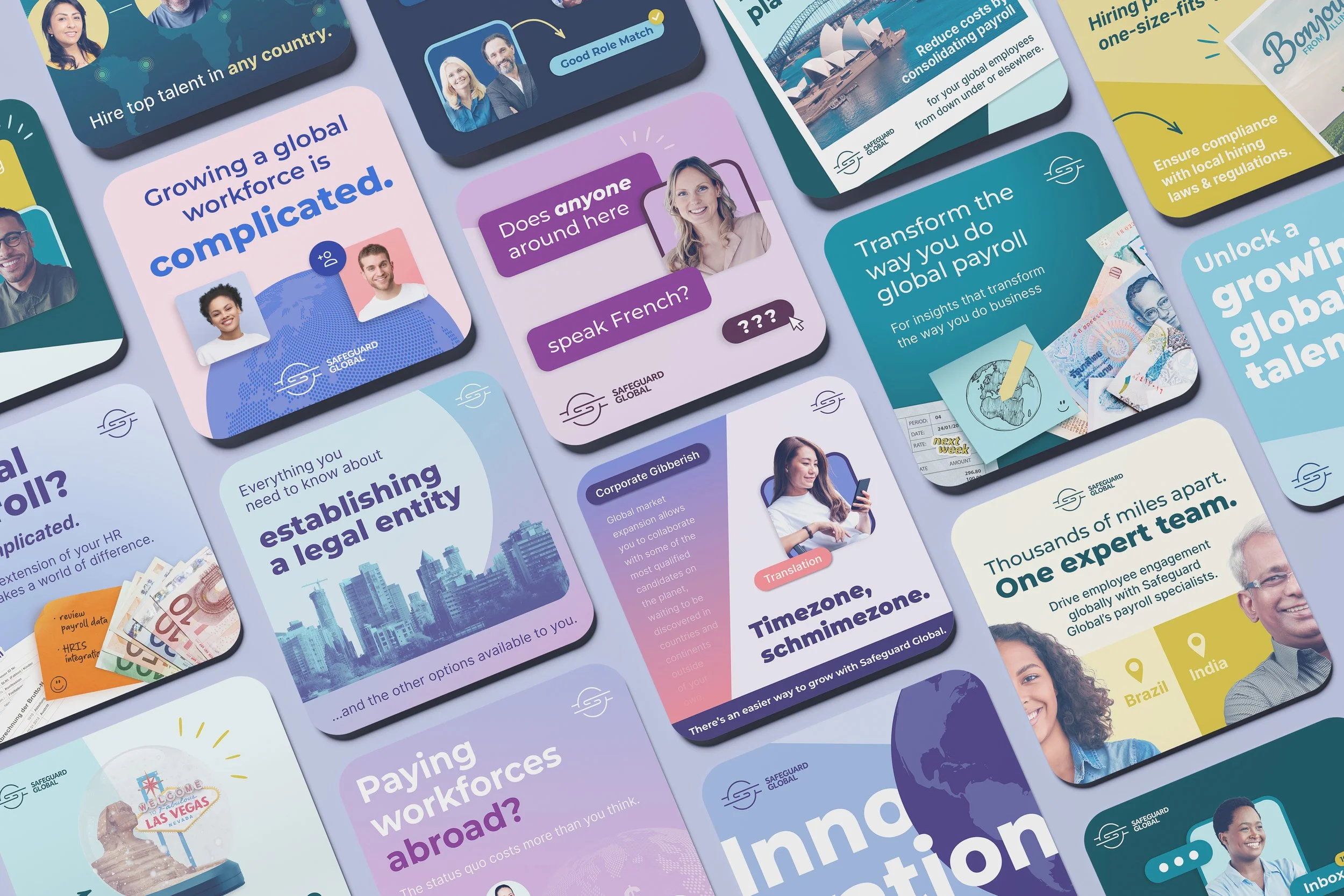
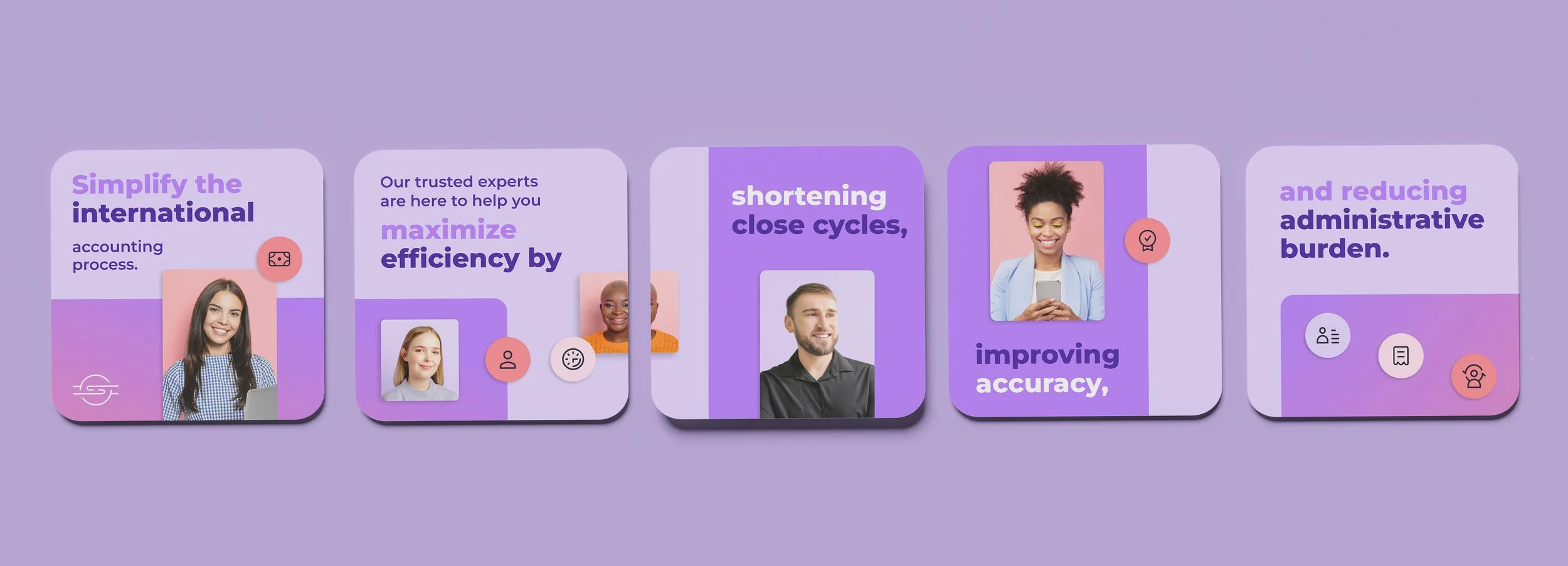
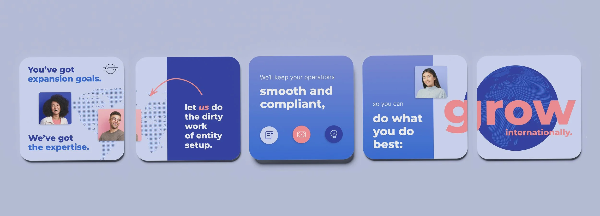
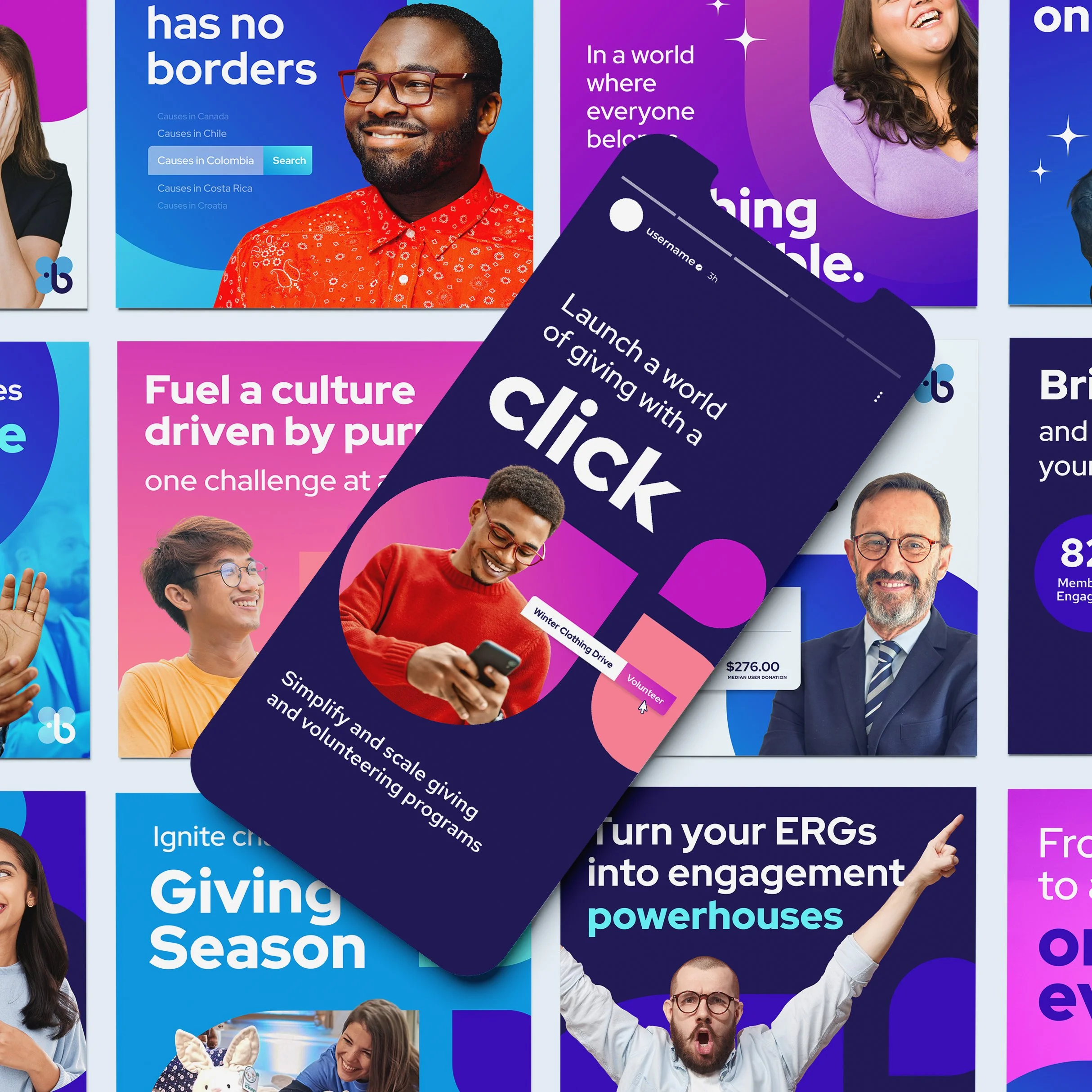
Designing for the speed of social. This multi-year project focused on pushing the boundaries of a brand's visual asset library to keep up with a fast-moving digital audience. By balancing constant creative evolution with strategic messaging, we kept ad campaigns fresh, engaging, and high-performing over the long haul.
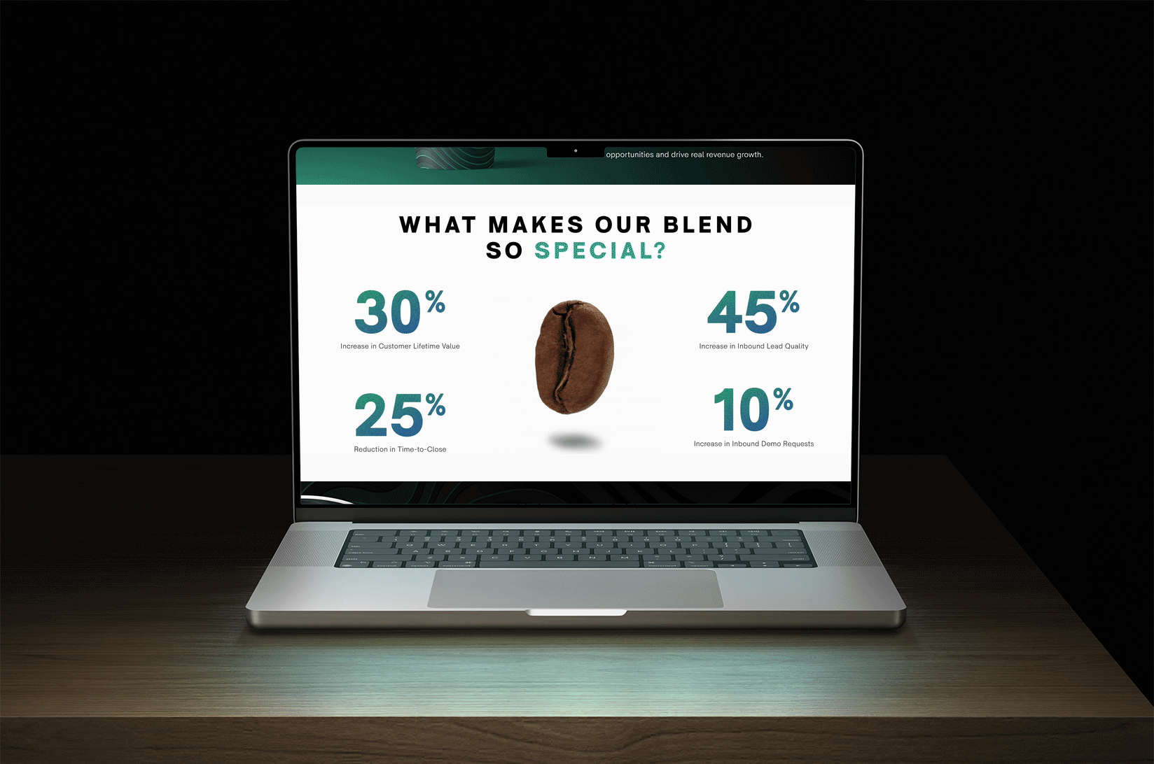
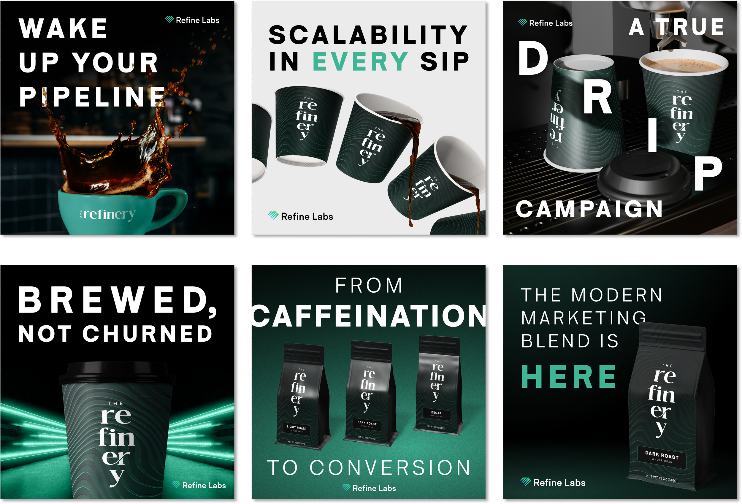
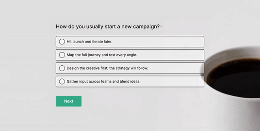
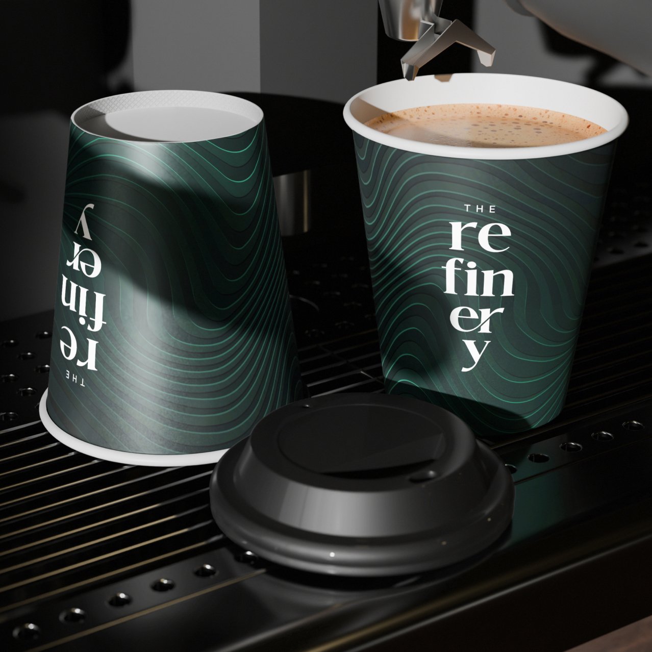
The Refinery is a “fake” coffee brand my team and I developed for a themed campaign that would allow us to advertise Refine Labs’ B2B services with appealing B2C style visuals to garner attention in feed. This campaign spanned paid media, organic social, landing pages and blogs. Most notably, the campaign was accompanied by a personality quiz à la Buzzfeed, which garnered a marked increase in organic engagement.
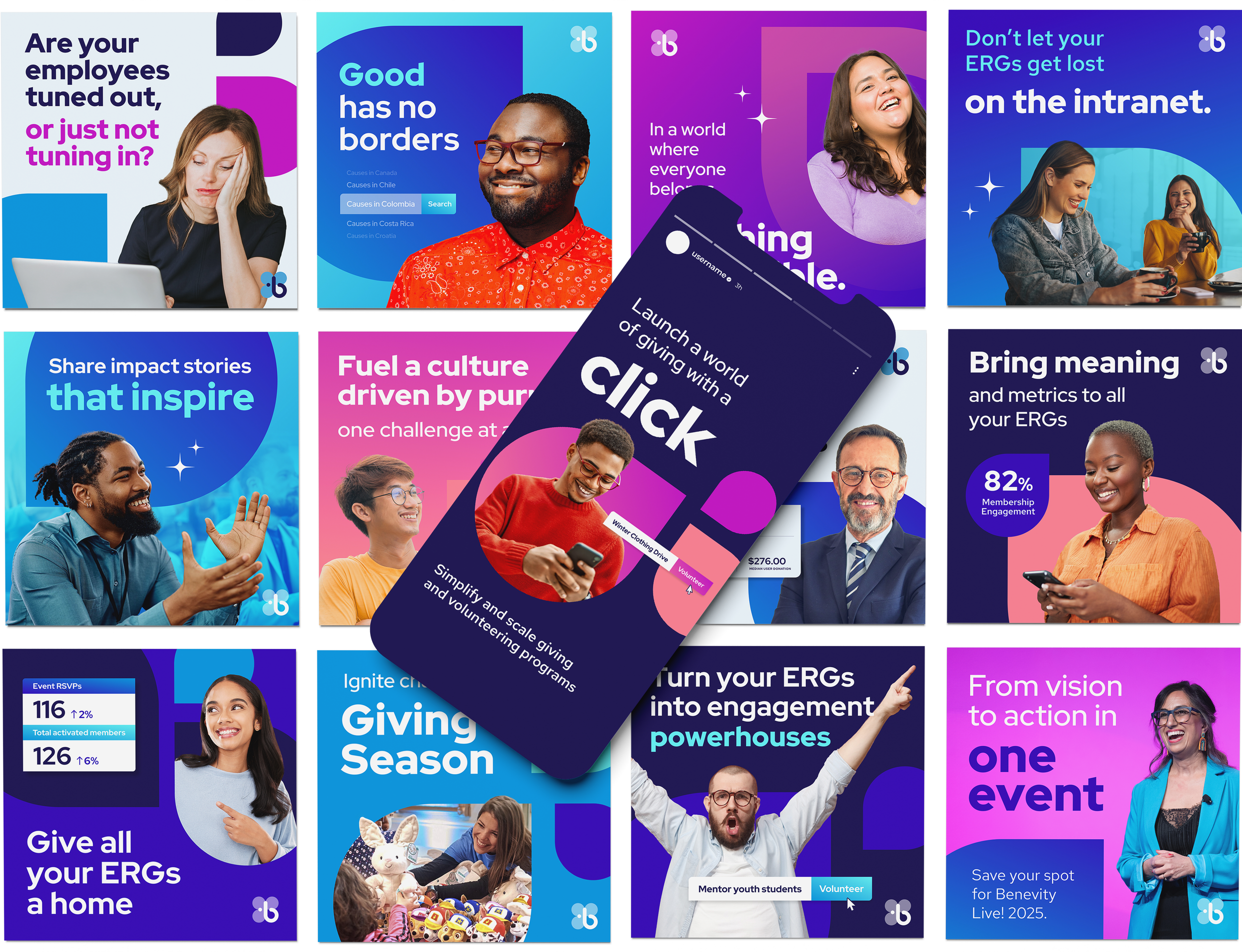
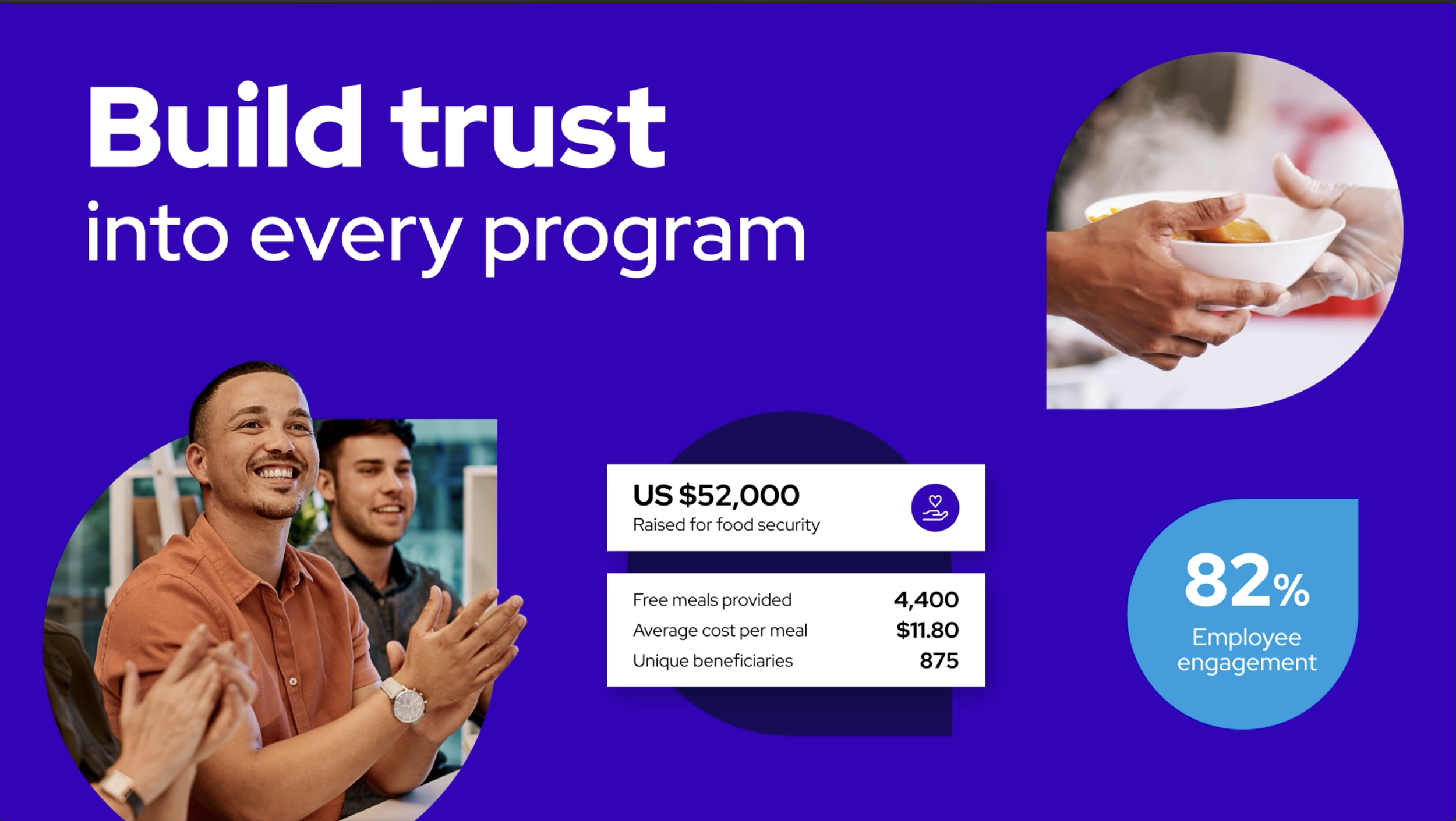
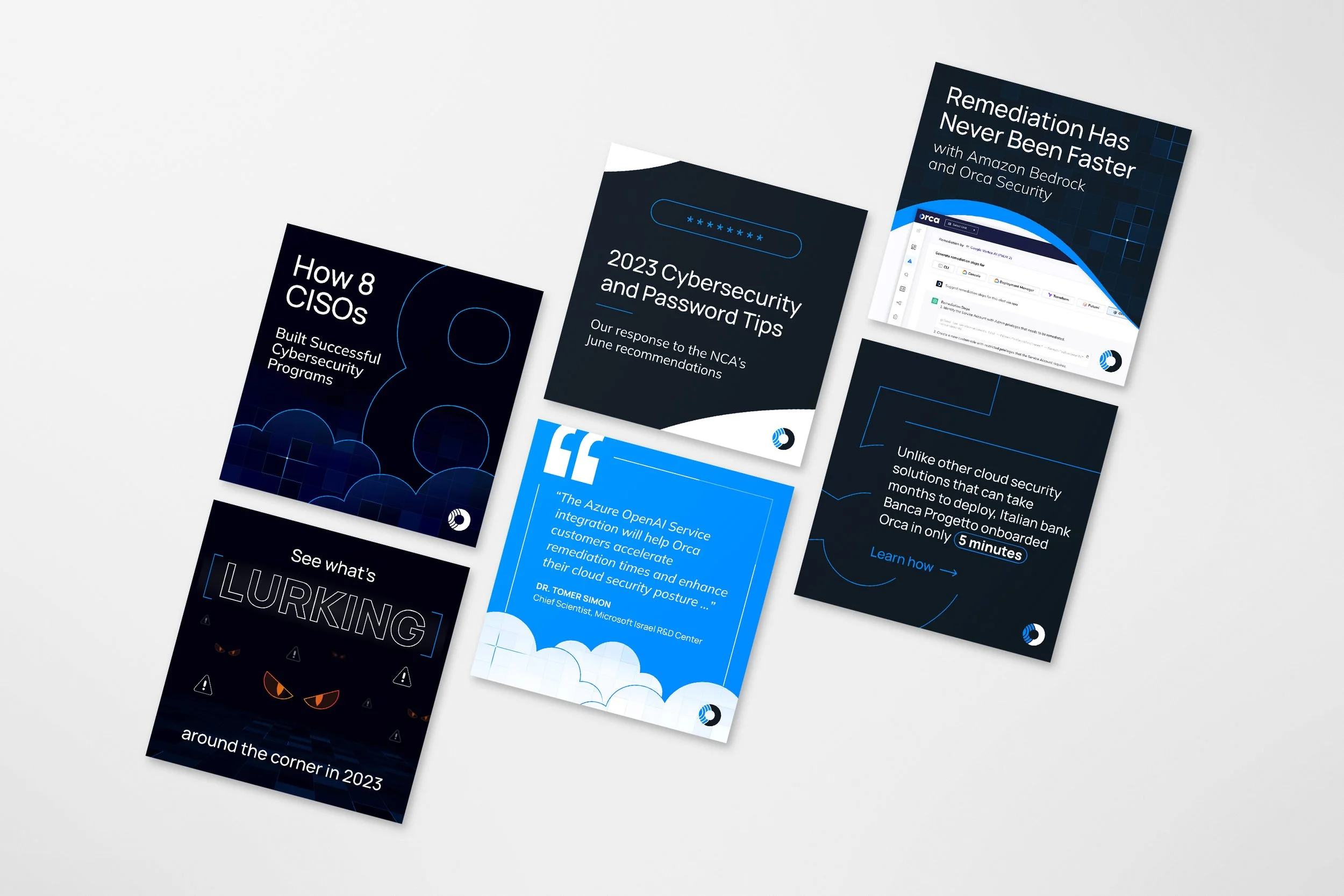
This project focused on building a dynamic suite of social media graphics and high-impact explainer videos tailored to showcase diverse product lines and distinct use cases. By aligning the creative direction with specific buyer personas, we crafted targeted stories that directly spoke to our key ICPs while keeping the overall brand identity cohesive.
As part of Porchlight’s collaboration with IGA, we were asked to develop quarterly marketing strategies accompanied with seasonal messaging and graphics. We developed a signage standard that evolves through the seasons while maintaining the recognizable IGA look. This project relied heavily on photo sourcing and art direction to make the signs come to life.
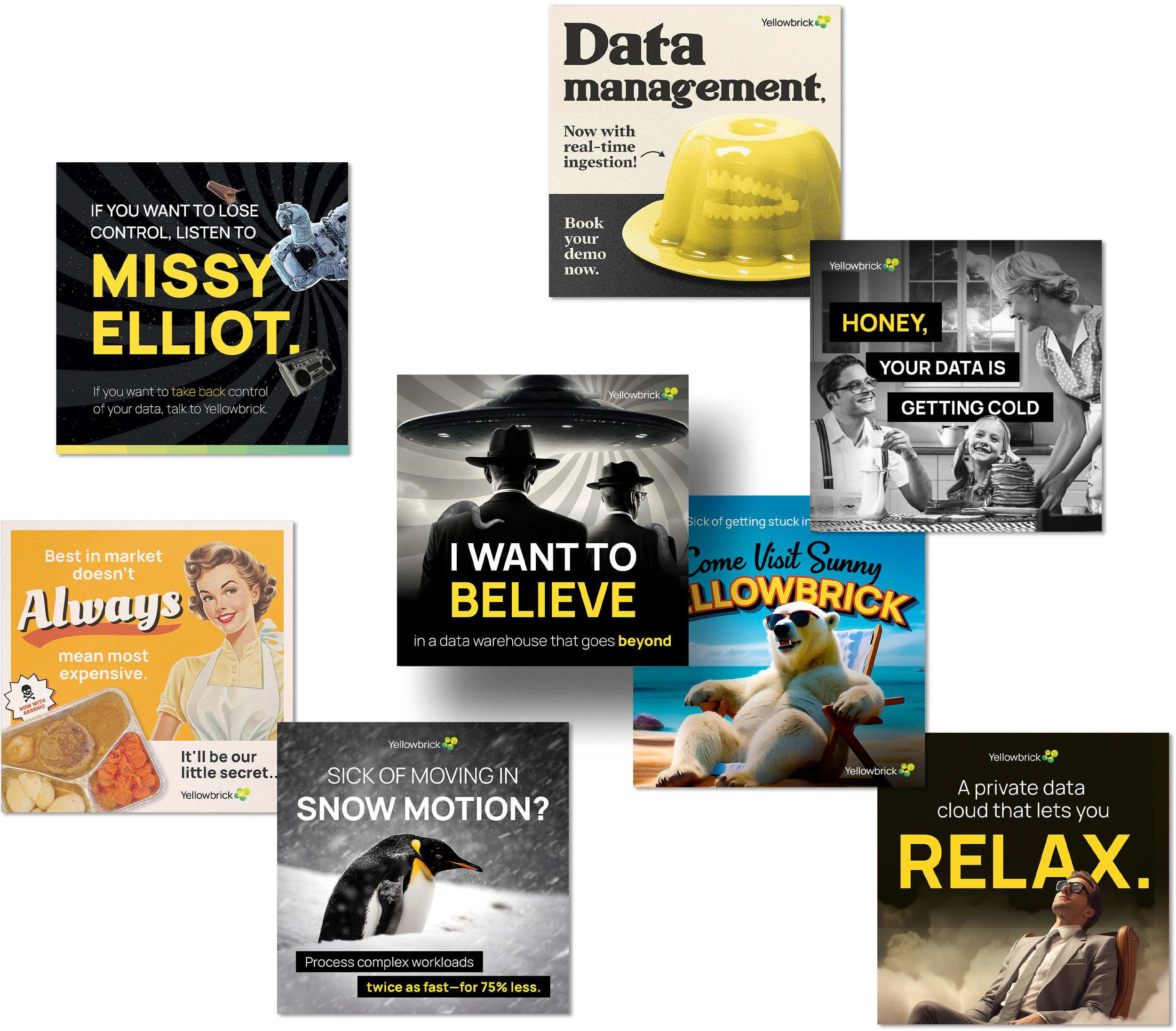
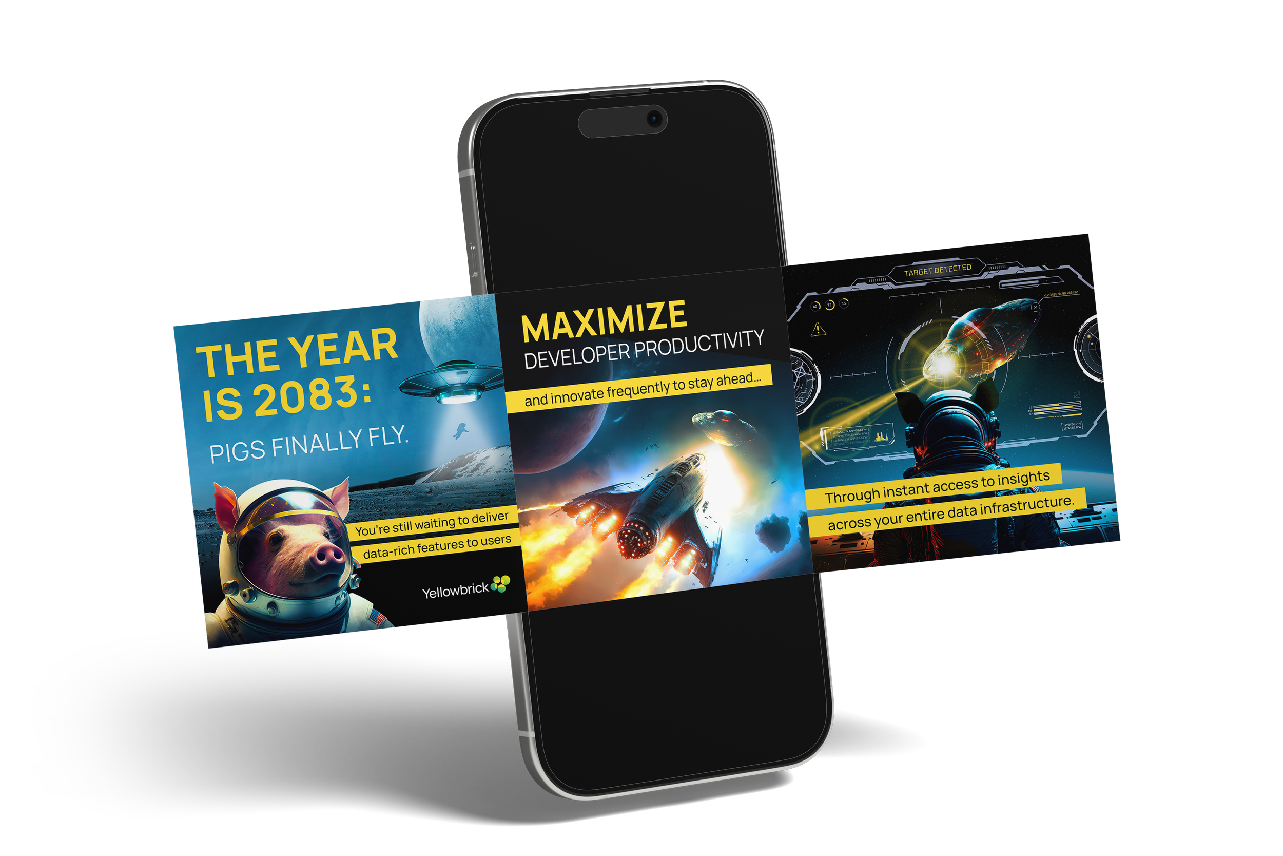
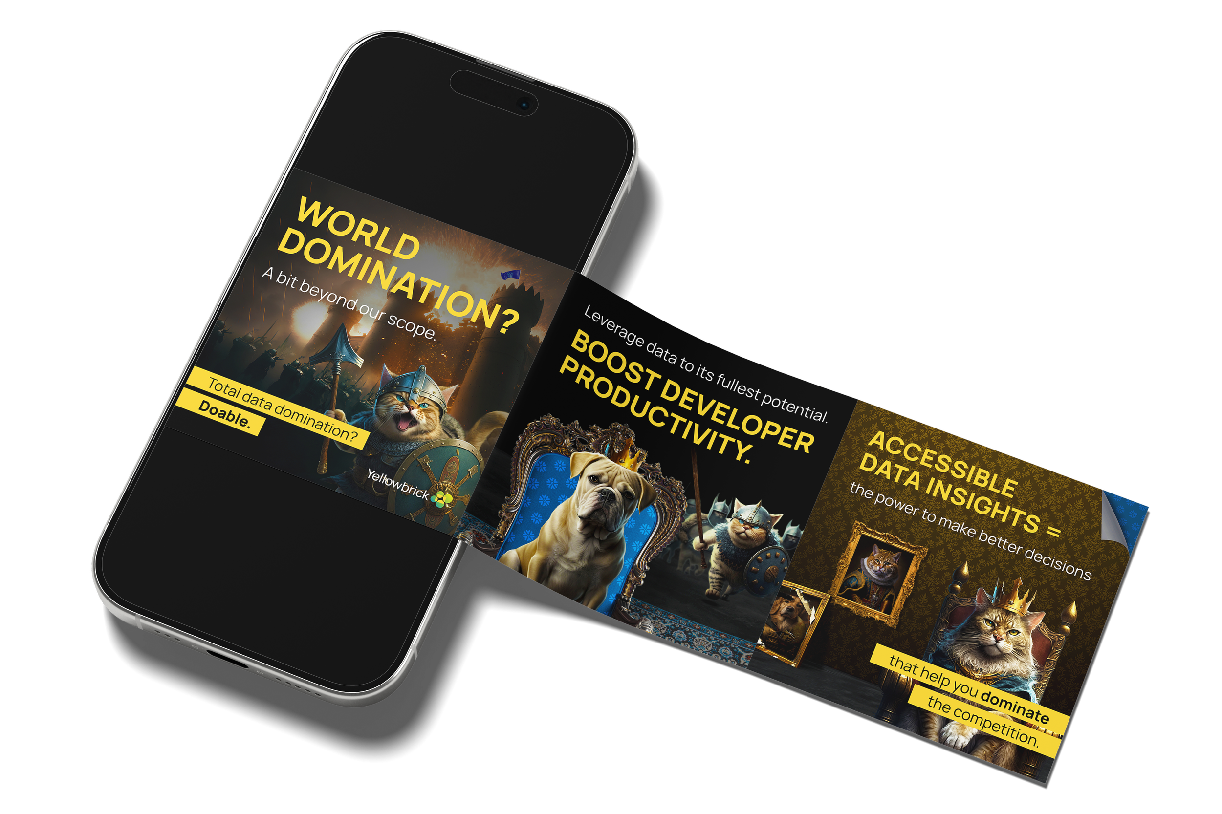
Disrupting the B2B tech space with a B2C mindset. This project brought highly conceptual, tongue-in-cheek humor to data cloud services, turning complex technical concepts into entertaining, scroll-stopping social media graphics. By using wit to capture attention and driving users to deep-dive landing pages, we successfully bridged the gap between social engagement and conversion. To complete the ecosystem, I led a website redesign that elevated the brand's digital presence while maintaining its unique brand perspective.
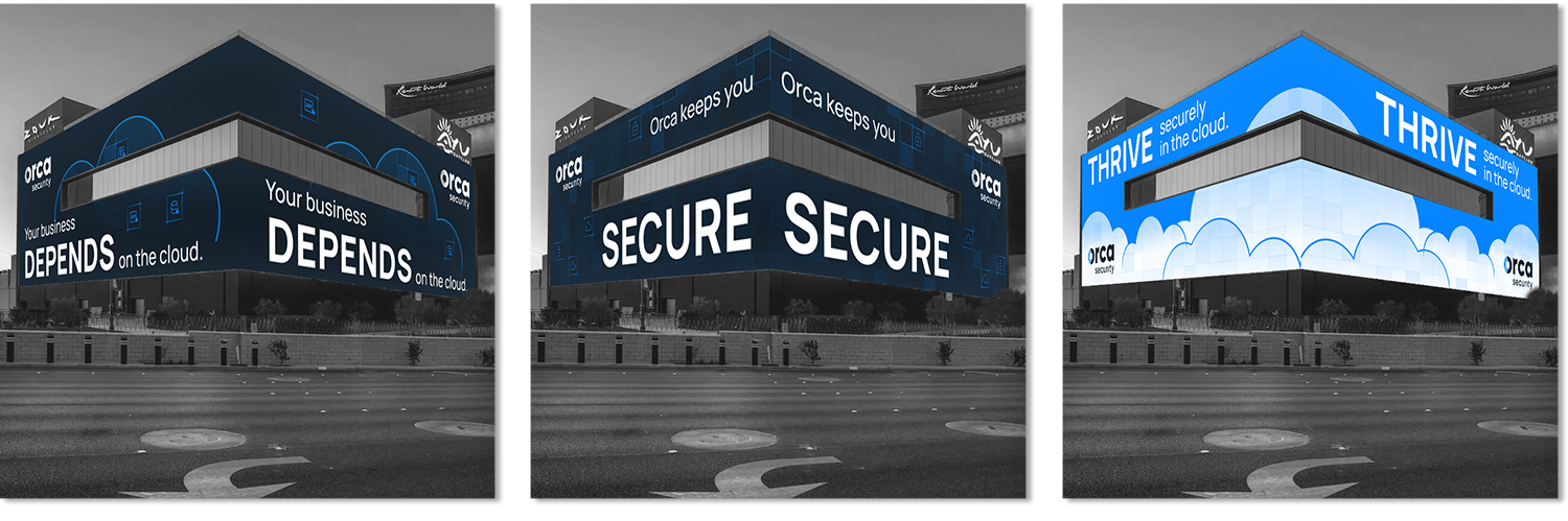
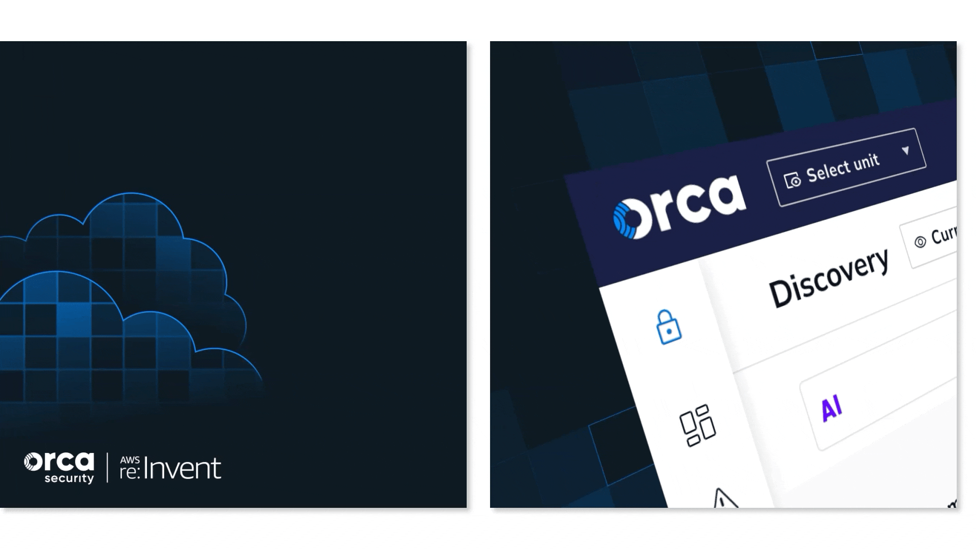
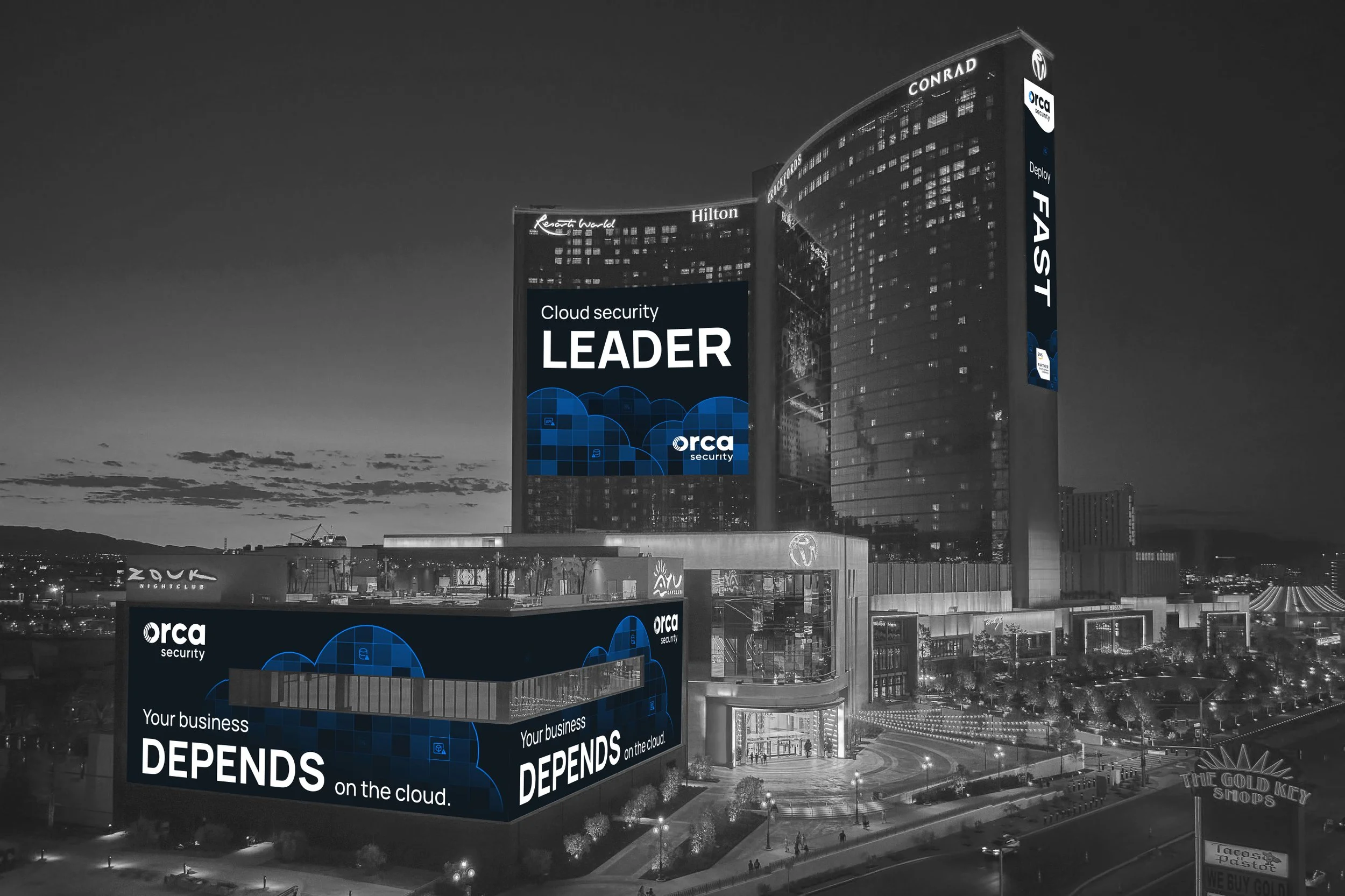
While working with Orca on paid and organic social, I also had the opportunity to create motion graphics for three large scale billboards for an OOH campaign. Located right off the Las Vegas Strip, the intent was to promote their booth at AWS re:Invent, an industry conference.
For the IGA proprietary packaging I worked with my team at Porchlight to develop and implement a packaging brand design and strategy. For the next two years I oversaw the consistency of brand implementation across hundreds of skus. As part of this project I coordinated with the client, printers, product suppliers and a photographer to facilitate the package production.
Every Gator Counts is a campaign through the U Matter, We Care program created by the University of Florida's Dean of Students Office. Throughout the year many promotional and informational items need to be created to inform the university's campus about the program.
The branding for That Flippin Girl was intended for a young adult audience with a modern farmhouse design influence. The logo and website were developed with a modern and on-trend look and feel.
While working at TRINDGROUP, we slowly designed new collateral assets for our client Heartland Catfish Company, meant to adjust their brand identity to be lighter and brighter to reflect their new brand messaging as a fresh, healthy choice.
Completed for a client of Porchlight, MSI Surfaces, to supplement their internal design efforts. The project includes fresh email templates for their various branded messages, static and animated social media ads and a set of videos that showcase the trends the brand will highlight in 2022.
Silver Ships was in need of updated trade show collateral pieces that focused on their distinct product lines. A design was developed that made the boat hull the hero. Each boat series in the collateral piece has unique characteristics that can now be visually referenced in the header.